This guide shows you how to build and customize email layouts using Sender's drag-and-drop editor. You'll learn how to navigate the editor interface, add and arrange content blocks, adjust settings, preview your design, and save your work.
Where to Find This Feature
In the Sender dashboard, go to: Email campaigns → click the edit (pencil) icon next to any draft campaign → Edit design.
This opens the drag-and-drop editor. The editor has three main areas: a left sidebar with panels for Building blocks, Section templates, and Template settings; a central canvas where your email design is displayed; and a top toolbar with undo, redo, Preview, Send test email, and Save & continue buttons. When you select a block on the canvas, a settings panel opens on the right side.
Steps to Build an Email in the Editor
Step 1 — Get to Know the Editor Layout
When the editor loads, the Building blocks panel opens on the left by default. The left sidebar includes icon-based tabs for Section templates, Building blocks, Template options, Template settings, Version history, and Keyboard shortcuts.
A block is a single content element such as a headline, image, or button. The central area is the canvas — this is where you assemble your email by adding and arranging blocks. The top toolbar displays your campaign name, a Changes saved indicator, and action buttons.
Step 2 — Add a Block to the Canvas
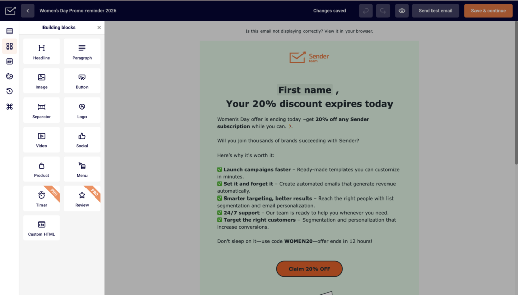
In the Building blocks panel, you'll see available blocks: Headline, Paragraph, Image, Button, Separator, Logo, Video, Social, Product, Menu, Timer, Review, and Custom HTML.
Drag any block from this panel and drop it onto the canvas where you want it to appear. A blue drop indicator line shows where the block will land. Release to place the block. It appears immediately on the canvas in the position you chose.
Step 3 — Select and Edit a Block
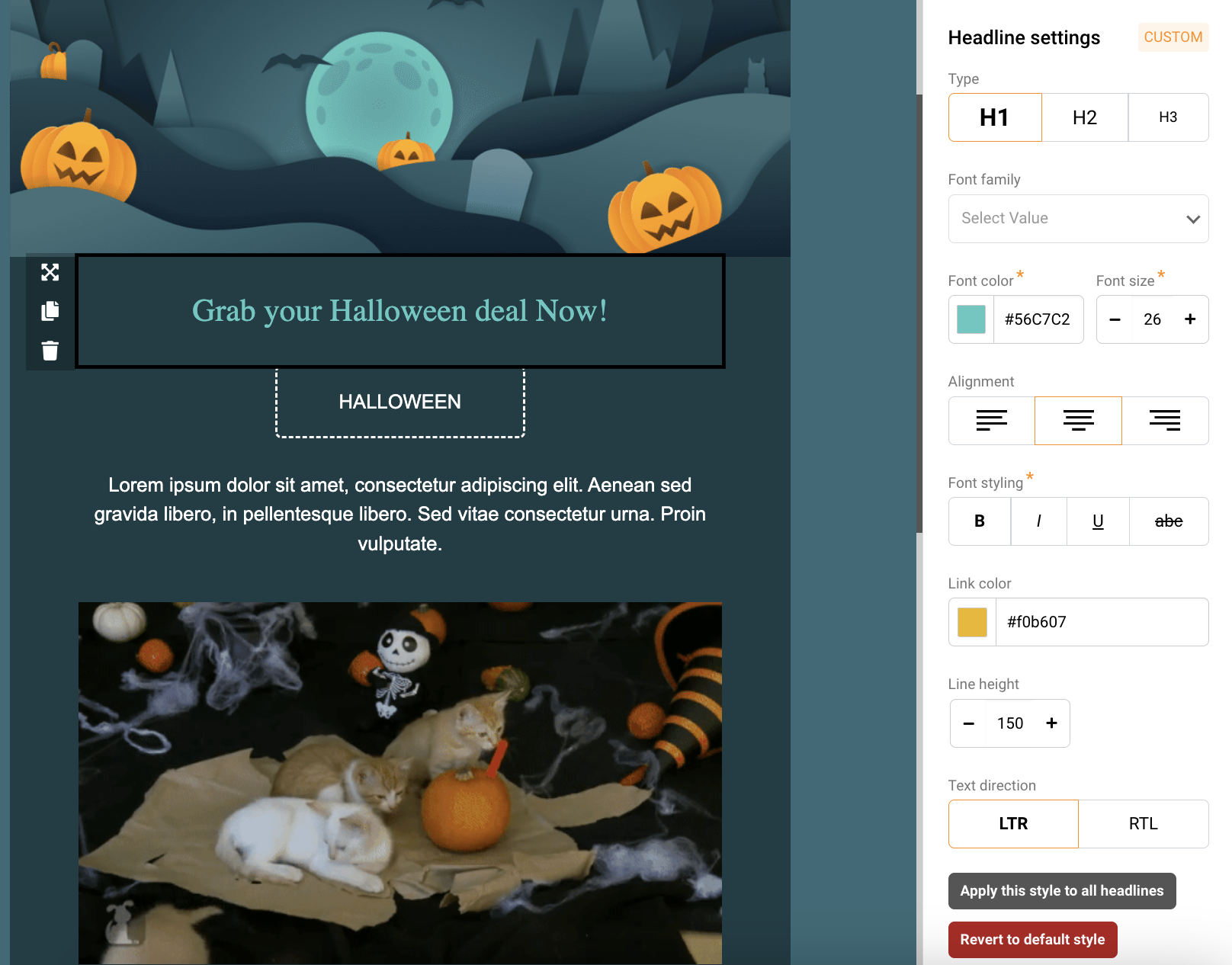
Click any block on the canvas to select it. A block-type settings panel opens on the right side of the screen. For example, clicking a Headline block opens Headline settings with options for Type (H1, H2, H3), Font family, Text color, Link color, Alignment, Font styling (bold, italic, underline, strikethrough), Font size, Line height, and Text direction.
To edit the text content directly, click the Edit text icon in the block toolbar that appears above the selected block.
Step 4 — Move, Duplicate, or Delete Blocks
When you select a block, a toolbar appears above it on the canvas with several action icons. Use Drag block to reposition the block by dragging it. Click Move up or Move down to shift the block one position in either direction. Click Duplicate block to create an identical copy directly below. Click Delete block (trash icon) to remove the block from the canvas.
Step 5 — Adjust Block and Column Settings
With a block selected, scroll down in the right panel to find Block settings and Column settings.
Under Block settings, adjust Spacing values for Top, Bottom, Left, and Right to control padding around the block, and set a Background color.
Under Column settings, you can change the column's Background color, set Vertical alignment (Bottom, Middle, or Top), and toggle Visibility on mobile between Show and Hide.
Step 6 — Use Section Templates for Faster Layouts
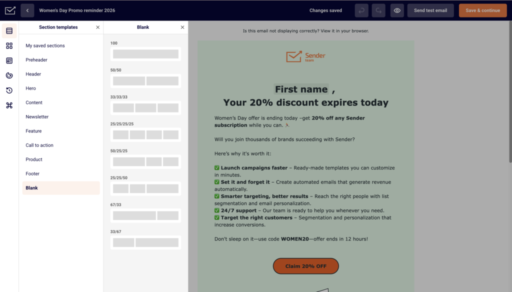
Click the Section templates icon (top icon in the left sidebar) to browse pre-built layout sections. Categories include Preheader, Header, Hero, Content, Newsletter, Feature, Call to action, Product, Footer, and Blank.
You can also access My saved sections to reuse sections you have saved previously. Drag a section template onto the canvas to add a fully structured layout that you can then customize block by block.
Step 7 — Customize Template-Wide Settings
Click the Template settings icon in the left sidebar (the globe icon) to open global design controls.
Under General settings, adjust Background color, Content background color, Background image, Language, and Preheader text. Below that, expand sections for Headlines, Paragraph, Buttons, Separator, Section settings, and Preview & Unsubscribe to set default styles that apply across your entire email.
Step 8 — Preview, Test, and Save Your Email
Click the Preview button (eye icon) in the top toolbar to see how your email looks before sending. Use Send test email in the top toolbar to send a test version to an email address and check how it renders in an actual inbox.
When you're finished, click Save & continue to save your design and return to the campaign workflow. To exit without continuing, click the back arrow next to the campaign name or use Save and go back.
Editor Tips
Use section templates to save time — Instead of building every row from scratch, drag a pre-built section from the Section templates panel and customize the placeholder content.
Check mobile visibility — Open Column settings for any block and use the Visibility on mobile toggle to hide elements that don't work well on smaller screens.
Set global styles first — Before adding content, configure your fonts, colors, and button styles in Template settings. This ensures a consistent look across all blocks without adjusting each one individually.
Duplicate blocks instead of rebuilding — If you need a similar block elsewhere in your email, select the original and click Duplicate block in the block toolbar. Then edit the copy as needed.
Save reusable sections — Use Template options → Save as template to store a finished design for future use. You can also save individual sections through the Section templates panel under My saved sections.
Common Issues
Block won't drop onto the canvas → You may be dragging to an invalid position. Make sure you see a blue drop indicator line on the canvas before releasing the block. Drag slowly and position your cursor inside the canvas area.
Settings panel doesn't appear → The right panel only opens when a block is selected on the canvas. Click directly on a block element (such as a headline or image) to select it and trigger the settings panel.
Changes are not saving → The editor auto-saves periodically and shows a Changes saved indicator in the top toolbar. If you don't see this confirmation, click Save & continue manually before leaving the editor.
Top toolbar disappears → The top toolbar hides when you scroll down or when the right settings panel is active. Scroll to the top of the canvas or close any open side panels to bring it back into view.
FAQs
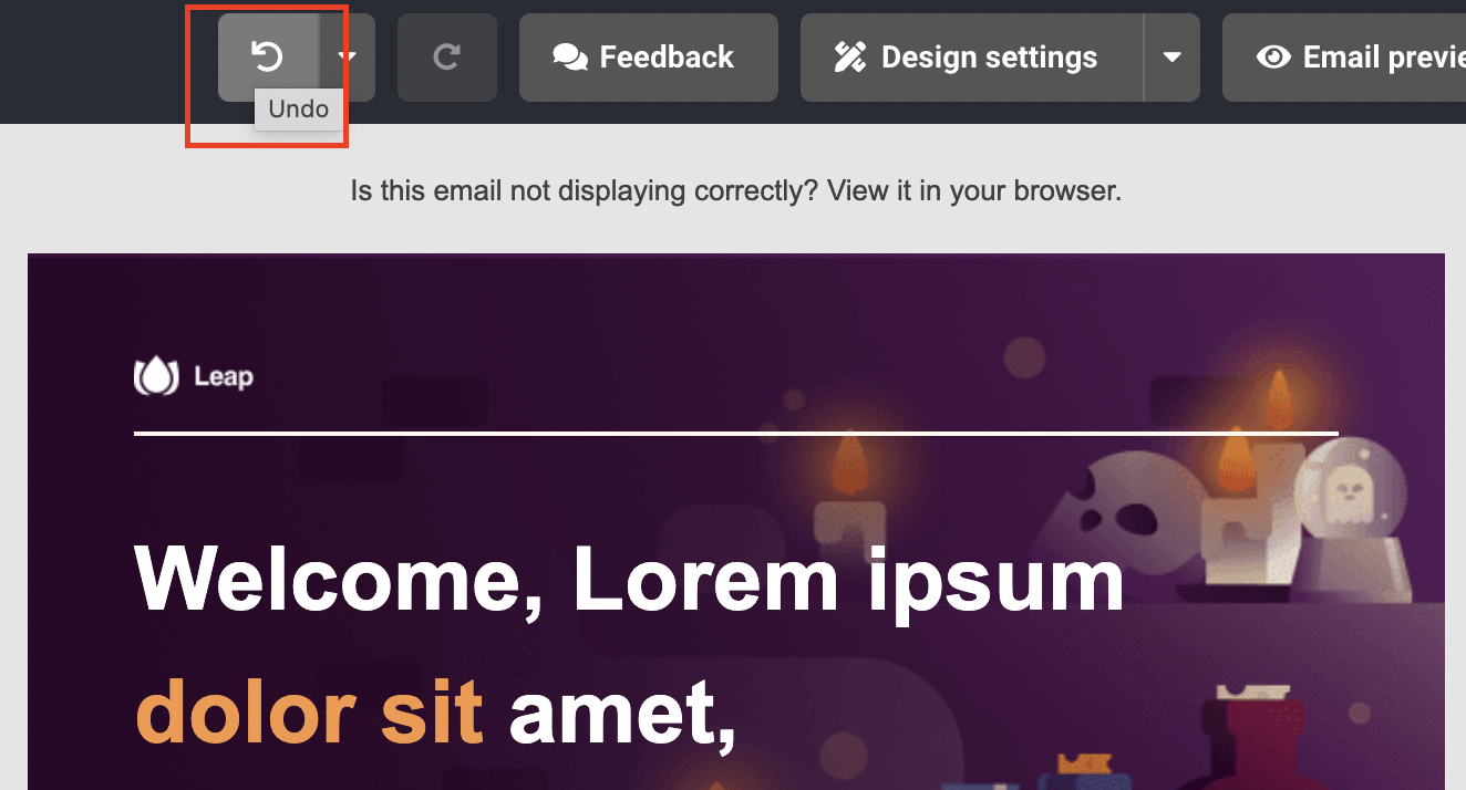
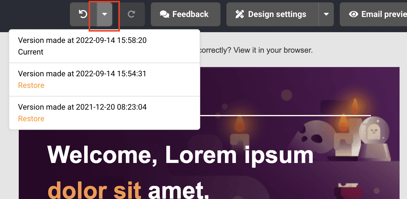
Can I undo changes in the editor?
Yes. Click the undo button (curved arrow) in the top toolbar to reverse your last action. Click redo (forward arrow) to restore it. You can also use keyboard shortcuts — press Ctrl+Z (or Cmd+Z on Mac) to undo and Ctrl+Y (or Cmd+Y) to redo.
What is the difference between a block and a section?
A block is a single content element such as a headline, image, paragraph, or button. A section is a larger layout structure that contains one or more blocks arranged in rows and columns. You can add individual blocks from the Building blocks panel or full sections from the Section templates panel.
Can I reorder blocks without dragging?
Yes. Select a block on the canvas and use the Move up or Move down icons in the block toolbar to shift it one position at a time.
How do I change the email background color?
Open Template settings from the left sidebar. Under General settings, adjust the Background color field to change the outer background or the Content background color field to change the inner content area.
Does the editor work the same in automations and campaigns?
Yes. The drag-and-drop editor behaves the same regardless of whether you open it from a campaign, an automation, or a template. All building blocks, settings, and toolbar options are identical.