Need to check information about a specific subscriber? You can easily view detailed information about any contact in your Sender account, including their profile, activity, and engagement history.
How to View Subscriber Details
Go to Subscribers in the left sidebar
Find the subscriber you want to view
Click on the subscriber to open their profile
What You Can See
Email campaign – Email address, source, and status (Active/Unsubscribed)
SMS campaign – Phone number or option to add one
First name and last name
Subscription date
Any custom fields you’ve collected
Groups, which showcase what lists the subscriber is a part of
Subscriber Activity
Field updates and changes
Form visits and interactions
Email opens, clicks, and engagement
Exact timestamps for all activities
Filter Activity Options: You can filter the activity timeline to focus on specific types of interactions:
Opens – When they opened your emails
Clicks – Links they clicked in your campaigns
Unsubscribes – Any unsubscribe actions
Bounces – Failed email deliveries (hard or soft bounces)
Spam reports – If they marked your emails as spam
Emails – All email campaigns sent to the subscriber
Subscriber changes – Profile updates, list changes, etc.
Use these filters to quickly find specific activities or troubleshoot delivery issues. For example, filter by “Bounces” to see if there are delivery problems, or check “Opens” and “Clicks” to understand their engagement level.
That’s it!
If you are stuck on a specific task or can’t find a way to execute a particular job, contact our support team via LiveChat or [email protected] – we’re here to help 24/7.
Want to be instantly notified whenever someone submits your form? You can easily set up an automation that sends you an alert every time a new subscriber fills it out.
Step-by-Step Setup
Step 1: Create Your Form
Navigate to Forms in your dashboard
Click Create new form
Choose your desired design from the available templates
Add your form fields (name, email, message, etc.)
Step 2: Configure Group Settings
Go to Settings → Groups
Select or create a group for your form
Make sure to assign your form to the appropriate group.
Step 3: Save Your Form
Make sure to save the creation of the form
Verify all settings are properly configured before clicking the “Publish” button
Step 4: Create Notification Workflow
Go to the Automations tab
Click Create new workflow
Select Create from scratch
Step 5: Set Up the Trigger
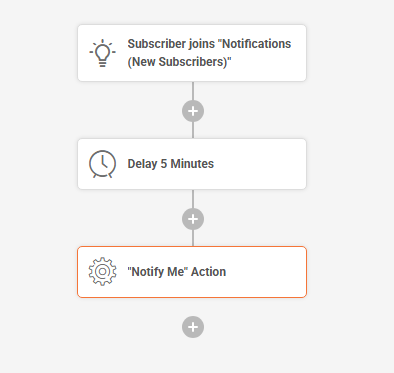
Choose the “Subscriber joins group” trigger
Select the group you assigned to your form in Step 2
Step 6: Add Delay
Add a Delay action of at least 5 minutes
This prevents immediate notifications and allows for processing
Step 7: Add Notification Action
Add a “Notify Me” action as the final step
Configure the notification settings as needed
An Example of such Workflow would look like this:
Step 8: Test Your Setup
Submit a test entry through your form
Wait for the 5-minute delay to pass
Check that you receive the notification
Make adjustments if needed
That’s it!
If you got stuck on a specific task or can’t find a way to execute a particular job, contact our support team via LiveChat or [email protected] – we’re here to help 24/7.
In Sender, you can organize subscribers with Groups or Segments. Each has a different purpose, and knowing the difference helps you manage your audience effectively.
What Are Groups?
Groups are static lists of subscribers that you create manually.
Manual membership: You add subscribers to a group during import or later by editing their profile.
Doesn’t change automatically: Subscribers remain in the group until you remove them.
Multiple groups allowed: One subscriber can belong to more than one group.
What Are Segments?
Segments are dynamic subscriber lists created with rules and conditions.
Automatic membership: Subscribers join or leave a segment based on whether they meet the conditions you set.
Updates daily: The system refreshes segments so they always reflect the latest subscriber data.
Flexible rules: You can combine multiple filters, such as location, activity, or custom fields
When to Use Each
Use Groups when you want full manual control over who belongs to a list (e.g., tagging event attendees).
Use Segments when you want your list to update automatically (e.g., targeting active buyers or re‑engaging inactive subscribers).
By combining both, you can keep your subscriber management simple and powerful: use groups for organization, and segments for smart targeting.
That’s it!
If you got stuck on a specific task or can’t find a way to execute a particular job, contact our support team via LiveChat or [email protected] – we’re here to help 24/7.
Landing pages are a powerful way to grow your audience, promote special offers, or collect leads — all without needing a separate website. With Sender’s built-in landing page builder, you can quickly create and publish beautiful, mobile and tablet-friendly pages that match your brand.
Whether you want to launch a newsletter sign-up form, announce a product launch, or offer a downloadable resource, our landing pages make it easy.
In this guide, we’ll walk you through how to create and customize your first landing page step by step — from choosing a layout to publishing it live. Let’s get started!
Creating a landing page
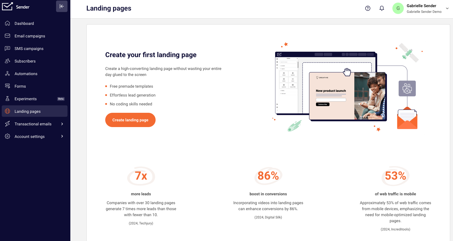
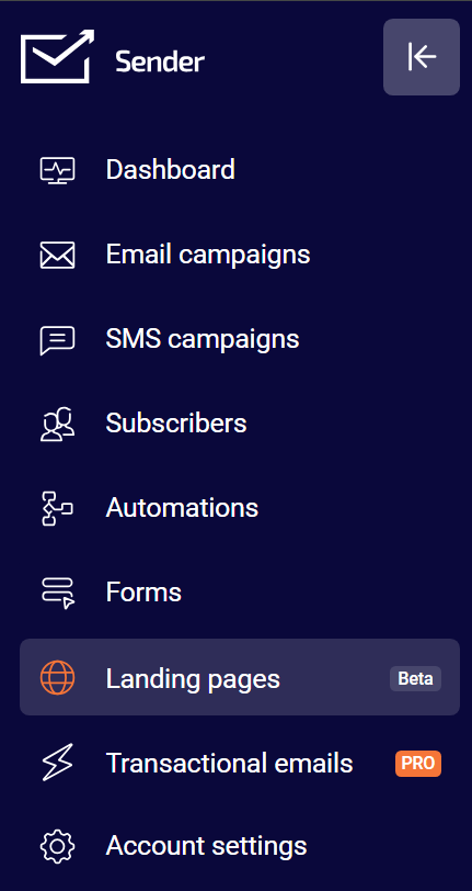
To create a landing page, head to “Landing pages” from the menu on the left and then “Create landing page”.
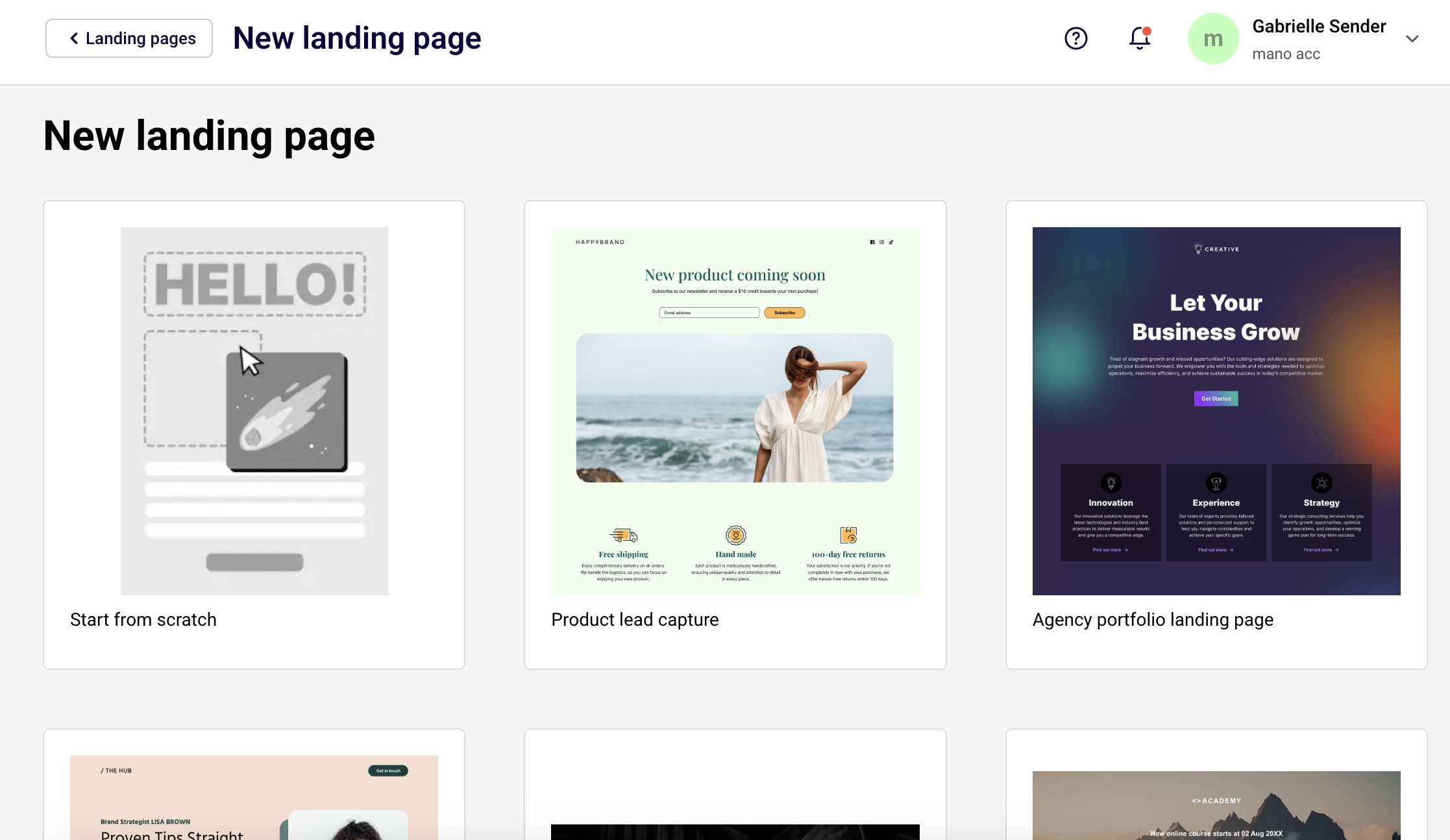
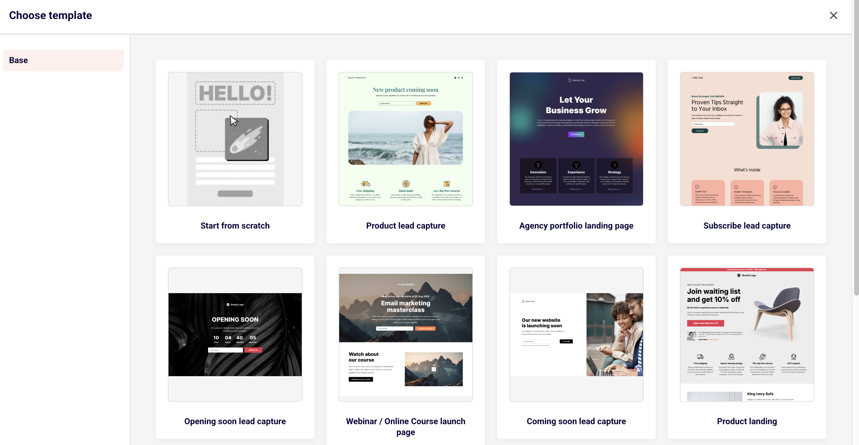
You will be asked to choose your landing page template or you can start creating one from scratch.
You will then be asked to name your landing page.
Another pop-up will give you an option to go through a quick tour around the landing page building, which we highly recommend. It will give you a great overview of the different sections and options for your creation process.
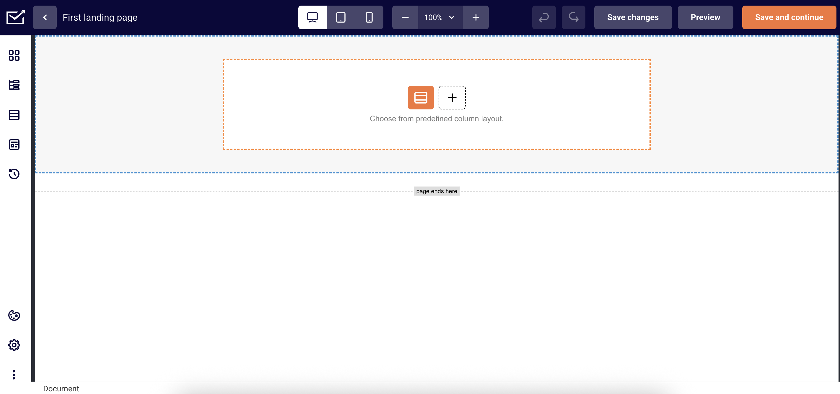
Landing page builder looks quite similar to our Drag and Drop editor made for email campaigns. It has blocks, sections and other editing tools for anything you add into your page.
Content blocks include:
Headline – Create compelling titles that capture attention and communicate your main message.
Paragraph – Insert formatted text content to provide detailed information, descriptions, and messaging throughout your page.
List – Create organized bullet points or numbered lists to present features, benefits, or step-by-step information clearly.
Buttons – Add clickable call-to-action buttons that direct visitors to take specific actions like signing up, purchasing, or contacting you.
Icon – Include visual icons and symbols to enhance your design and communicate concepts quickly and effectively.
Accordion – Display collapsible content sections that allow visitors to expand and view information while keeping your page organized and clutter-free.
Profile – Showcase team members, testimonials, or personal information with dedicated profile sections including photos and descriptions.
Social – Integrate social media links, feeds, or sharing buttons to connect your landing page with your social media presence.
Rating stars – Display star ratings and review scores to build trust and showcase customer satisfaction or product quality.
Review – Feature customer testimonials and detailed reviews to provide social proof and build credibility with potential customers.
Timer – Create countdown timers to add urgency to limited-time offers, events, or product launches.
Counter – Show animated number counters to highlight statistics, achievements, or key metrics that demonstrate your success.
Menu – Add navigation menus to help visitors easily browse different sections or pages of your website.
Progress – Display progress bars or indicators to show completion status, skill levels, or step-by-step processes.
Map – Embed interactive maps to show your business location, service areas, or event venues for easy navigation.
Layout options:
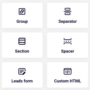
Column – Organize content side-by-side in flexible column layouts for better visual structure.
Separator – Add dividing lines and visual breaks to separate different sections clearly.
Section – Group related content together with customizable background colors and spacing.
Spacer – Control vertical spacing between elements to improve page flow and readability.
Leads form – Capture visitor information with customizable signup and contact forms.
Custom HTML – Insert your own code for advanced functionality and unique design elements.
Media block:
Image – Add photos, graphics, and visual elements to enhance your message and design.
Gallery – Showcase multiple images in an organized, browsable collection or slideshow.
Video – Embed videos to demonstrate products, share stories, or engage visitors dynamically.
Carousel:
Review carousel – Display multiple customer testimonials in a rotating slideshow format.
Gallery carousel – Showcase collections of images that visitors can browse through automatically or manually.
Team carousel – Present your team members in a scrollable format with photos and information.
Video carousel – Feature multiple videos in an interactive slideshow for dynamic storytelling.
Image carousel – Create sliding image displays perfect for highlighting products or key visuals.
Version history:
If you need to undo edits or restore a previous version of your landing page, you can use the “Version history” feature. This tool automatically saves different versions of your work as you build, allowing you to easily revert to any earlier state of your page. Simply access the version history to view and restore any saved version whenever needed.
Section templates:
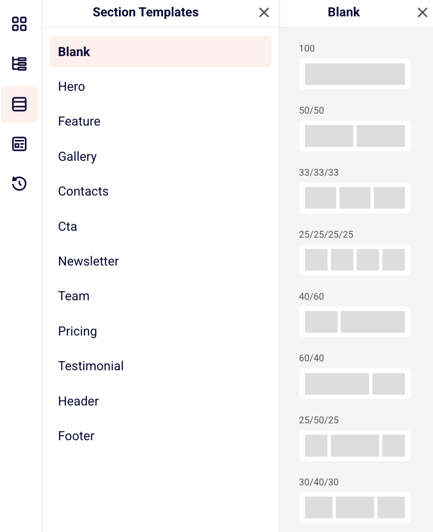
There is a variety of pre-designed section templates to help you create your landing page quickly and easily: from impactful hero sections, organized feature displays, to compelling call-to-action areas, you can choose from multiple template options for each section type.
These ready-made templates provide different layouts, styles, and arrangements that you can customize with your own content, saving you time while ensuring your landing page looks polished and professional.
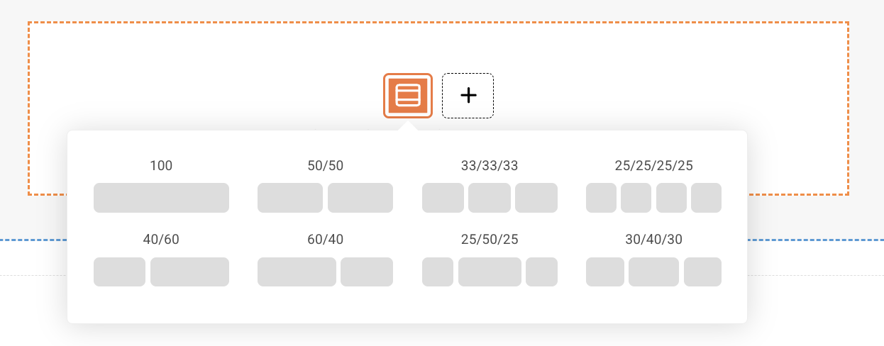
You can also choose one, two or more slots when adding a new section directly in the template editor.
Templates:
For those who find building from scratch challenging, we offer complete landing page templates to get you started. These professionally designed templates can be easily customized with your own content and branding. Simply choose a template, replace the placeholder content, and you’ll have a polished page ready in minutes.
Editing landing page:
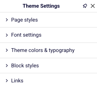
You can edit your landing page by customizing individual blocks or applying settings to the entire theme for consistent styling. Individual blocks can be modified separately to meet specific needs, while theme-wide settings allow you to control the overall appearance across your entire page.
These global settings include page style, font settings, theme colors and typography, block styles, and link formatting to ensure a cohesive and professional look throughout your landing page.
Site settings:
SEO settings – Configure your site title, craft compelling meta descriptions, add relevant tags, and upload a favicon to improve search engine rankings and click-through rates,
Global CSS – Add custom styling code that applies to your entire page, allowing for advanced design customizations beyond the standard theme options,
Scripts – Insert essential tracking codes, analytics tools, or custom JavaScript functionality to monitor performance and add interactive features,
Map settings – Enter your Google Maps API key to enable interactive location displays and mapping functionality throughout your landing page,
Social share settings – Customize the preview image, title, and description that appear when visitors share your page on social media platforms, ensuring consistent branding and messaging.
Additional notes:
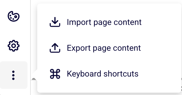
You can easily import JSON-formatted page content to quickly load existing designs or export your current landing page for backup or reuse purposes.
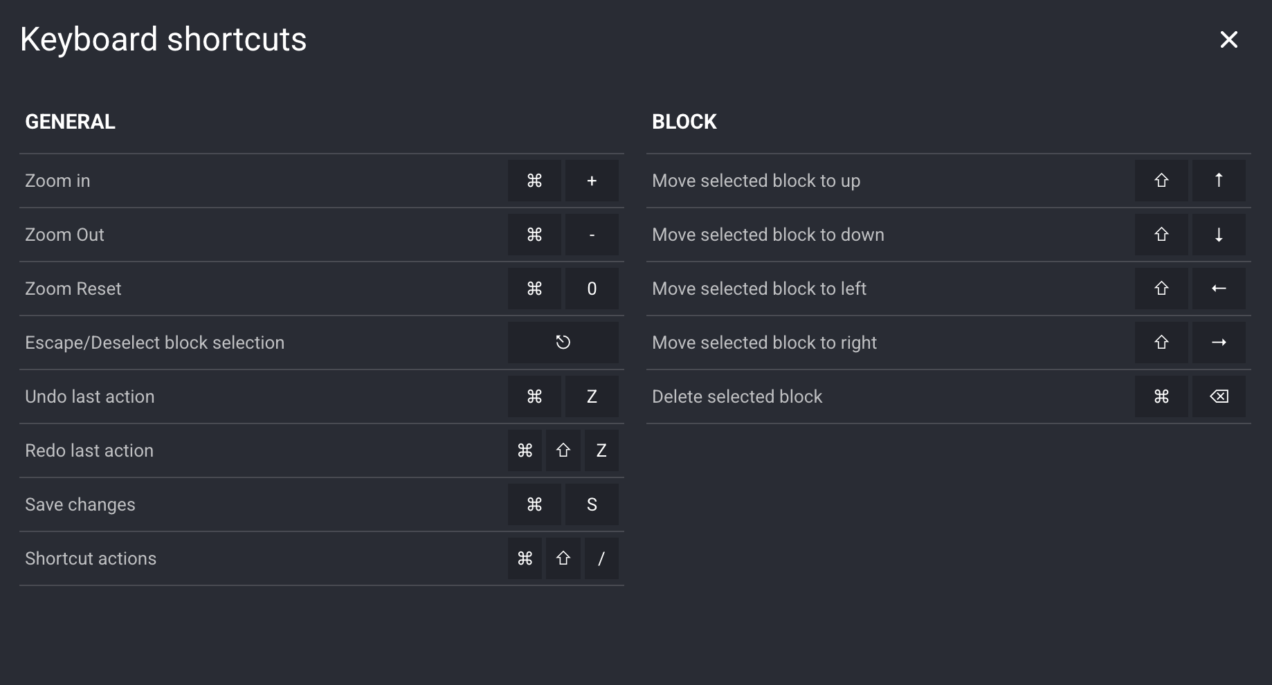
Additionally, the landing page builder includes comprehensive keyboard shortcuts to streamline your workflow and make page creation more efficient. These shortcuts allow you to build faster without constantly switching between mouse and keyboard.
If you got stuck on a specific task or can’t find a way to execute a particular job, contact our support team via LiveChat or [email protected] – we’re here to help 24/7.
Need to save or share your email campaign offline? You can easily download any of your email campaigns as a PDF file. This is perfect for archiving campaigns, sharing with team members who don’t have account access, or including in reports and presentations.
How to Download Your Campaign as PDF
Step 1: Go to Email Campaigns
Log into your Sender account.
Click Email campaigns in the left sidebar.
Find the campaign you want to download.
Step 2: Download the PDF
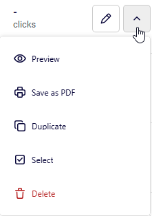
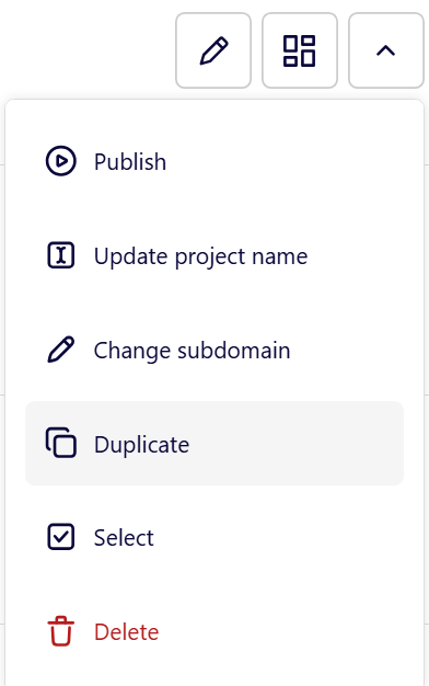
Click the Little Arrow ( ^ ) next to your campaign.
Select “Save as PDF” from the dropdown menu.
Your campaign will be downloaded as a PDF file to your device.
When to Use PDF Downloads
Team sharing – Share campaigns with colleagues who don’t have Sender access.
Client presentations – Include campaign mockups in proposals or reports.
Archive keeping – Save important campaigns for future reference.
Print purposes – Create physical copies for offline review.
Design approval – Send campaigns to stakeholders for approval before sending.
What’s Included in the PDF
The PDF download captures your complete email design exactly as recipients would see it, including:
All text content and formatting
Images and graphics
Layout and styling
Header and footer elements
All of the links that were used in the campaign
The Bottom Line
Downloading campaigns as PDFs is a simple way to share, archive, and present your email designs outside of the Sender platform. It’s especially useful for getting approvals, creating documentation, or sharing work with people who don’t need full account access.
That’s it!
If you got stuck on a specific task or can’t find a way to execute a particular job, contact our support team via LiveChat or [email protected] – we’re here to help 24/7.
Need to create a new landing page similar to one you already have? Duplicating saves time and lets you build on what’s already working. Instead of starting from scratch, copy your best-performing page and modify it for new campaigns.
Why Duplicate Landing Pages?
Save time – No need to rebuild layouts and designs from scratch.
Keep consistency – Maintain your brand look across campaigns.
Build on success – Start with pages that already convert.
Easy A/B testing – Create variations to test different elements.
Scale campaigns – Quickly launch multiple similar campaigns.
How to Duplicate a Landing Page
Step 1: Access Your Landing Pages
Log into your Sender account
Go to Landing pages in the left sidebar
Find the page you want to duplicate
Step 2: Duplicate the Page
Click the Little Arrow (^) next to your chosen page
Select “Duplicate” from the dropdown
Your page is copied instantly
Step 3: Customize Your Copy and Update:
Page name and subdomain
Headlines and offers
Images and graphics
Call-to-action button text
Form fields if needed
Best Practices
Choose the Right Page to Copy
Start with your highest-converting pages
Pick pages with similar goals to your new campaign
Consider your target audience
What to Always Change
Page title and headlines
Offer details and pricing
Images and graphics
Call-to-action button text
Smart Organization
Use clear names: “Summer Sale – Facebook Ads”
Update subdomains for different campaigns
Keep track of which page came from which
Common Use Cases
Seasonal campaigns – Copy holiday pages for new seasons
Different traffic sources – Adapt the same offer for Facebook vs Google ads
A/B testing – Test different headlines while keeping everything else the same
Product launches – Use successful product pages as templates
Audience targeting – Create versions for different customer segments
After Duplication:
Test Everything:
Check all links and buttons work
Verify forms submit properly
Test on mobile and desktop
Make sure images load correctly
Check that conversion tracking works
Monitor performance vs the original
Troubleshooting
Page won’t load? Check for broken links or missing images.
Changes not saving? Make sure you’re in edit mode and try refreshing.
Looks different? Some elements might need to be reconfigured after copying.
The Bottom Line
Duplicating landing pages is the fastest way to scale your marketing. Start with what works, customize for new campaigns, and launch faster than building from scratch.
That’s it!
If you got stuck on a specific task or can’t find a way to execute a particular job, contact our support team via LiveChat or [email protected] – we’re here to help 24/7.
Understanding email clipping helps you ensure your campaigns reach subscribers properly and maintain accurate performance tracking.
Email clipping occurs when Gmail detects that your message exceeds certain size limits. The size limit varies depending on the device your subscribers use to view your emails – desktop devices generally allow up to 102 KB, while mobile devices can be much more restrictive, with some iOS devices limiting emails to just 20 KB.
When your email gets clipped, Gmail also cuts off the tracking pixel that Sender uses to measure open rates, which means your campaign analytics won’t be accurate.
What happens when emails are clipped?
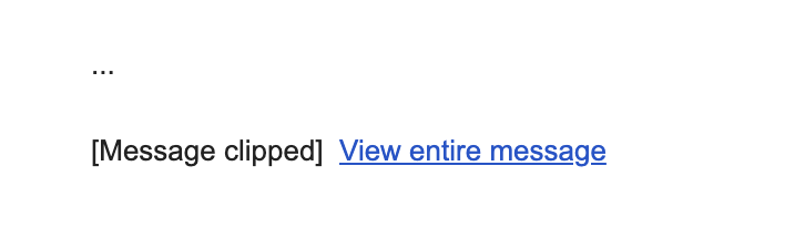
When Gmail clips your email, subscribers see a message like this:
If subscribers click “View entire message,” Gmail opens your email in their web browser, but this version may strip out some styling. Your carefully designed layout, colors, fonts, and formatting may appear broken or simply different from your original design.
Understanding size limits
Gmail’s size limits depend on the device:
Desktop: Generally around 102 KB
Mobile: Can range from 20 KB on iOS devices to approximately 75 KB on Android
The 20 KB limit on Gmail’s iOS app is particularly strict and inconsistently applied, making it one of the most challenging environments for email delivery.
Important: The size limit includes all HTML code, text content, CSS styling, and links, but does not include actual image file sizes. Images are hosted on Sender’s servers and loaded separately, so large images won’t directly cause clipping.
Your email might also be clipped if you send multiple test emails with identical subject lines to the same inbox, as Gmail may consolidate these into a conversation thread.
Checking your email size in Sender
Sender automatically monitors your email size and alerts you to potential clipping issues.
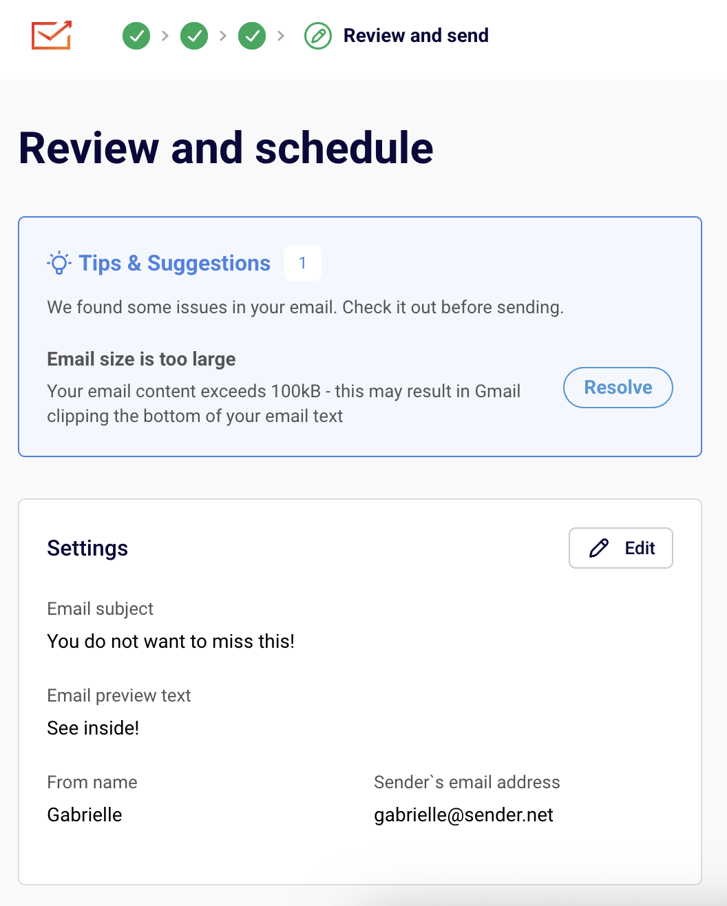
When your email exceeds the recommended size limits, you’ll see a Tips & Suggestions notification in the “Review and schedule” step of your campaign creation process. The warning will show:
Click the “Resolve” button to return to the email campaign editor and make changes if desired.
If your email includes dynamic content or personalization, preview it with different subscriber profiles since the final size may vary.
Size risk levels
Under 85 KB: Safe from Gmail clipping,
85-95 KB: Might be at risk, especially on mobile devices,
Over 95 KB: Very likely to be clipped – optimization recommended.
How to reduce email size
You can optimize your emails without removing content by making these adjustments:
Simplify your structure
Consolidate blocks: Combine multiple small text blocks with similar styling into fewer, larger blocks. Four separate text blocks contribute more to code weight than one larger block with the same content.
Merge sections: If you have multiple column sections in a row, combine them into a single layout rather than stacking separate sections.
Remove spacing sections: Look for opportunities to eliminate redundant spacing or padding sections.
Clean up content
Use plain text pasting: When copying from Word documents or websites, paste as plain text (Ctrl+Shift+V or Cmd+Shift+V) to avoid importing unnecessary styling code.
Remove unused styles: Clean up any redundant CSS rules that accumulated during design.
Optimize colors and fonts: Using fewer unique colors and fonts reduces overall code weight.
Optimize visual elements
Remove background images: Section background images add significant code weight. Consider replacing them with solid colors or simple patterns.
Minimize decorative elements: While images don’t count toward size limits, the HTML code needed to display them does. Focus on images that add value to your message.
Find problem areas
If you’re having trouble identifying what’s causing oversized emails:
Duplicate your email template
Remove sections or blocks one at a time
Check the size after each removal to identify the heaviest elements
Focus optimization efforts on components providing the biggest size reductions
Best practices
Design mobile-first: Since mobile devices have stricter limits, designing for mobile ensures emails work everywhere
Test regularly: Check email size throughout the design process, not just at the end
Use Sender templates: Start with our optimized templates designed to stay within size limits
Monitor performance: Keep an eye on open rates and delivery metrics to catch clipping issues early
Additional causes of clipping
Your message might also be clipped if you send multiple emails to the same inbox with identical subject lines. To avoid this, use unique subject lines when sending test campaigns.
That’s it!
If you got stuck on a specific task or can’t find a way to execute a particular job, contact our support team via LiveChat or [email protected] – we’re here to help 24/7.
Webhooks allow you to receive real-time updates about specific events in your Sender account by sending automated messages (payloads) to a URL you provide.
This feature is available with the Standard andProfessional plans and is a powerful way to sync data between Sender and your external systems.
How to set up your webhook
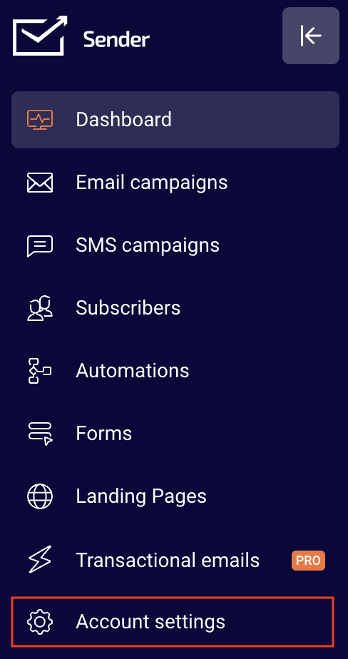
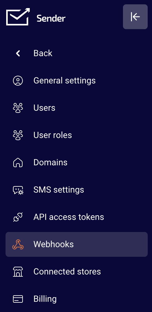
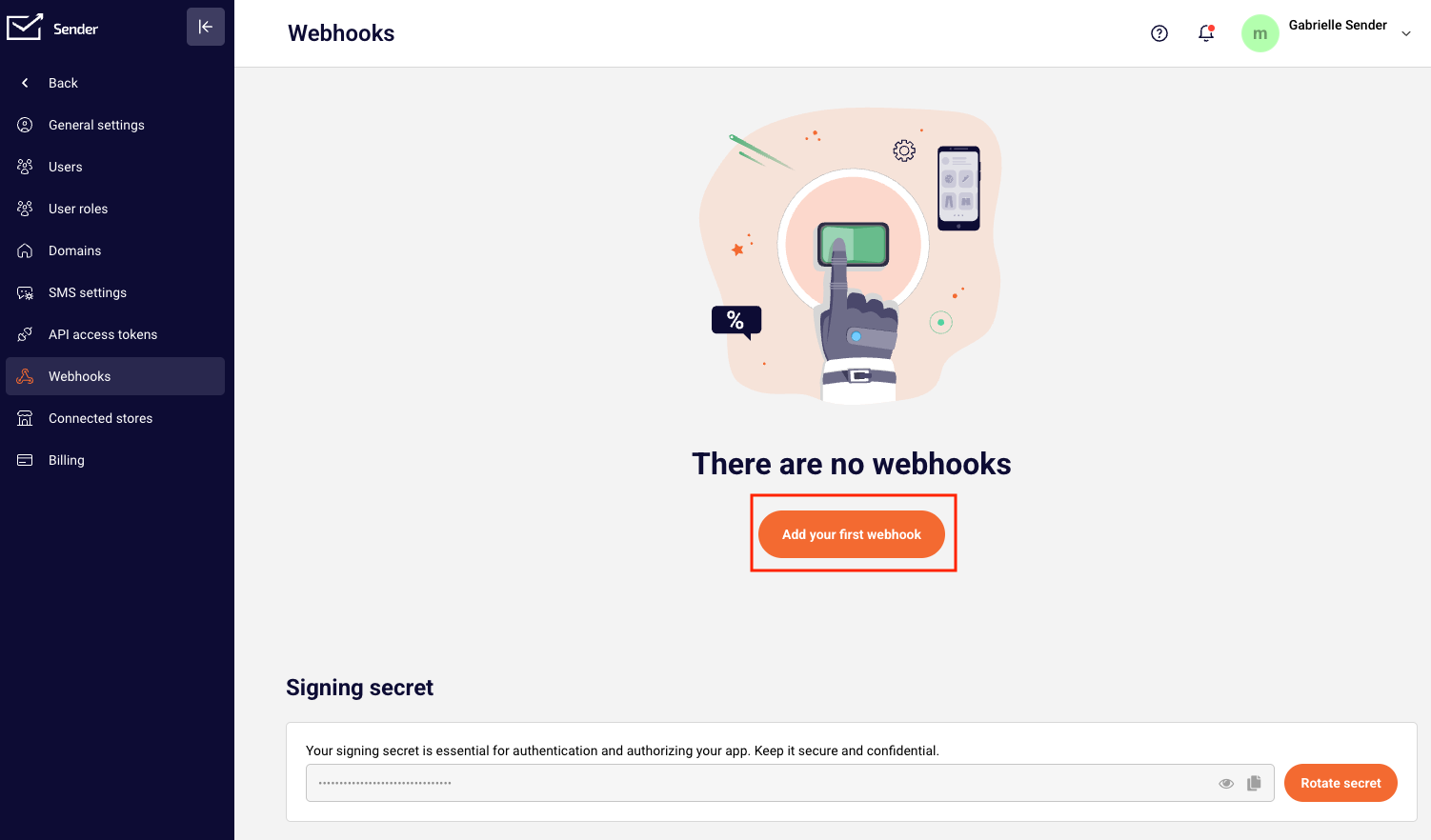
Go to Account settings and click Webhooks from the list.
Click “Add your first webhook”.
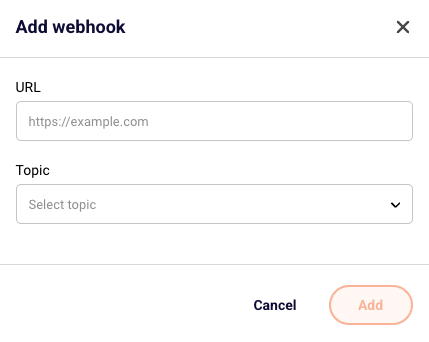
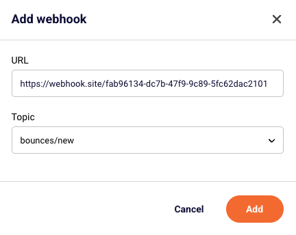
You will then be asked to provide a Webhook URL and select a topic.
The supported Webhooks include:
New subscriber added
New subscriber added to a specific group
Subscriber unsubscribed from a particular group
Subscriber data updated
Any subscriber unsubscribes
New campaign created
New group created
New bounces after sending a campaign
For this example, we chose new bounces after sending a campaign.
You can pause or reactivate your webhook at any time by clicking the Pause/Active button.
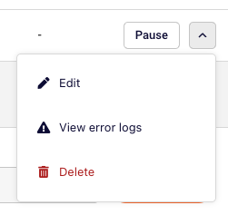
If you need to troubleshoot, edit or delete the webhook, click the arrow button next to your webhook.
Once the set webhook is triggered, the data appears like this:
In the webhook section, you’ll also find your Signing Secret. This is used for authenticating and authorizing your app.
You can use the copy button to quickly copy it
The eye icon is to view it.
Click “Rotate secret” to generate a new one if needed.
Common Use Cases
Automatically add new subscribers to your CRM
Trigger internal alerts or workflows when someone unsubscribes
Keep your customer database in sync with subscriber updates
Log bounce events to monitor deliverability
Update user tags or segments in external systems when subscribers join a specific group
That’s it!
If you got stuck on a specific task or can’t find a way to execute a particular job, contact our support team via LiveChat or [email protected] – we’re here to help 24/7.
Typography can make or break your landing page conversions. The right font doesn’t just look good—it makes your message easier to read, builds trust with visitors, and can actually increase your conversion rates. Google Fonts offers professional-quality typography for free, making it the smart choice for high-converting landing pages.
Why Google Fonts Are Essential for Landing Pages
They’re completely free with no licensing restrictions, load fast from Google’s optimized servers, work across all browsers, and integrate easily with most website builders.
Most importantly: good typography guides your visitors through your content smoothly and shapes their view of your brand. For landing pages, where the goal is to capture attention and drive action, nailing the typography is crucial.
Best Google Fonts by Function
Headlines (H1, H2)
Montserrat – Modern, clean, and attention-grabbing
Playfair Display – Elegant serif for luxury/premium brands
Inter – Clean sans-serif designed for digital interfaces
Roboto Slab – Contemporary serif for professional services
Body Text
Open Sans – Most popular, highly readable for longer text
Lato – Warm and approachable while maintaining professionalism
Source Sans Pro – Crisp and clear on all devices
Call-to-Action Buttons
Roboto – Strong and confident, makes CTAs pop
Montserrat – Bold weights perfect for standout buttons
Proven Font Combinations
Playfair Display + Lato. Headlines use elegant serif, body text uses friendly sans-serif. Perfect for sophisticated brands.
Montserrat + Open Sans Modern geometric headlines with clean, readable body text. Great for tech/SaaS companies.
Roboto Slab + Roboto Same font family provides natural harmony with clear hierarchy. Ideal for professional services.
Golden Rules:
Limit to 2-3 fonts maximum – More creates confusion
Pair serif headlines with sans-serif body text – Classic combination that always works
Choose different but complementary fonts – Contrast without chaos
Critical Font Sizes
Main headline (H1): 32-48px desktop, 24-32px mobile
Subheadings (H2, H3): 24-32px desktop, 20-24px mobile
Body text: 16-18px minimum (never smaller than 16px)
CTA buttons: 18-22px for maximum clickability
Important: Use relative units (ems/rems) instead of pixels for better mobile scaling.
Typography Best Practices That Convert
1. Create Clear Hierarchy
Biggest: Main headline (your core offer)
Medium: Subheadings and key benefits
Smaller: Supporting details
Standout: Call-to-action buttons
2. Mobile-First Approach
50% of web traffic is mobile. Test fonts on actual devices, ensure readability without zooming, and use 1.4-1.6 line height for comfortable reading.
3. Prioritize Readability
Ensure sufficient contrast between text and background
Avoid light gray text that’s hard to read
Remember: if visitors can’t read it, they can’t convert
4. Optimize Loading Speed
Use only 2-3 font weights (regular, bold, maybe light)
Skip italic unless essential
More font variations = slower loading = lower conversions
Conversion-Killing Font Mistakes
Using too many fonts – Looks unprofessional and confuses visitors
Choosing style over readability – Beautiful fonts that nobody can read don’t convert
Poor mobile experience – 79% of customers buy on smartphones
Loading too many font weights – Slows page speed and hurts conversions
Insufficient contrast – Makes people leave immediately
The Bottom Line
The best landing page fonts are the ones visitors don’t notice because they’re focused on your message and taking action. Typography shapes how people perceive your brand and directly impacts conversion rates.
Start with proven combinations like Montserrat + Open Sans, prioritize readability over fancy styling, and always test on mobile devices. Remember: visitors should think about your offer, not struggle with your font choices.
A well-designed landing page with proper typography can yield up to 27.4% higher conversions. That’s the difference between a successful campaign and a failed one.
Ready to create landing pages with typography that converts? Try Sender’s landing page builder with built-in Google Fonts integration and start designing pages that drive real results.
That’s it!
If you got stuck on a specific task or can’t find a way to execute a particular job, contact our support team via LiveChat or [email protected] – we’re here to help 24/7.
Want to get more eyes on your landing page? Social media is one of the best ways to drive traffic to your carefully crafted conversion pages. But here’s the thing—you can’t just slap a link up there and hope for the best.
Let’s dive into how to do it properly so you actually get people clicking, visiting, and converting.
Why Use Landing Pages Instead of Your Homepage
Here’s the deal: customers who engage with us via our social media outlets generally spend approximately 2x more than the average customer. But only if you treat them right when they click through.
When you send social media traffic to your homepage:
People get confused about what to do next
They explore other parts of your site and forget why they came
You miss out on conversions
When you send them to a dedicated landing page:
They know exactly what you want them to do
The message matches what they saw on social media
An effective landing page can yield as much as a 27.4%increase in conversions
Platform-Specific Tips
Facebook & Instagram
Use eye-catching visuals (videos perform especially well)
Use your Instagram to highlight your latest offer through compelling imagery
Update your bio link strategically for new campaigns
Test both organic posts and paid ads
X (Formally known as Twitter)
Match that Twitter mindset – quick, clever, and to the point
Use threads to tell a story that leads to your landing page
Include relevant hashtags for discoverability
LinkedIn
Share valuable insights that lead naturally to your offer
Target specific professional audiences with LinkedIn ads
Share case studies and success stories
TikTok
Create entertaining content that showcases your product
Use a descriptive headline “As seen on TikTok” on your landing page
Partner with creators who align with your brand
Make Your Pages Look Great When Shared
Open Graph (OG) image is a website thumbnail that displays when the page is shared on a social media platform and make sure to optimize these elements:
Title: Keep it under 60 characters and compelling
Description: Write 1-2 sentences that make people want to click
Image: Use high-quality visuals (1200×630 pixelsworks best)
Pro tip: Make sure your social media post visuals match your landing page design for a seamless experience.
Best Practices That Actually Work
1. Match Your Message
You should view your social media landing page as an extension of the social media post that led to it. If your Facebook ad promises “5 Ways to Double Your Email List,” your landing page better deliver exactly that.
2. Keep It Simple
Social media is busy and overwhelming. Your landing page should be the opposite. That is, Essential elements only:
Clear headline that matches your social media post
Brief explanation of your offer
Simple form or call-to-action button
One piece of social proof
Declutter the page by getting rid of clashing colors, lengthy copy, website menus, social share buttons, and other things that might bombard your visitors.
3. Mobile-First Design
Around 50% of all web traffic globally comes from mobile devices, and most social media traffic comes from phones. Your landing page better look amazing on mobile.
4. Remove Navigation
Don’t you dare just send your social fans to the homepage. Remove navigation menus and keep people focused on your main call-to-action.
5. Use Social Proof Smartly
Since people are coming from social media, they’re in a “social” mindset. Use testimonials and reviews strategically.
But remember: No social media tally is better than low social media tally. If you don’t have good numbers, don’t show them.
Common Mistakes to Avoid
Sending everyone to your homepage – Too many distractions
Mismatched messaging – If your post says “free trial” but your page says “getting started,” you’ll confuse people
Ignoring mobile – 79% of customers now buy products online using their smartphones
Too many options – When faced with too many choices, website visitors may end up taking no action at all
Measuring Success
Track these key metrics:
Click-through rate from social media to your landing page
Conversion rate once people reach your page
Cost per conversion (for paid social ads)
Social shares of your content
The Bottom Line
Sharing landing pages on social media isn’t about posting a link and hoping for the best. It’s about creating a seamless experience from social media curiosity to taking action.
Start with one platform where your audience is most active, create a landing page specifically for that audience, and test different approaches. Remember: every platform has its own personality, so adapt your approach accordingly.
New-school marketing is about leveraging the multiplicative network effects of social media – where people market on your behalf. When you nail the combination of compelling social content and focused landing pages, you create a powerful conversion machine.
Ready to create landing pages that convert social media traffic? Try Sender’s landing page builder and start turning your social media followers into customers today.
That’s it!
If you got stuck on a specific task or can’t find a way to execute a particular job, contact our support team via LiveChat or [email protected] – we’re here to help 24/7.