Blog

  • Fix Clipped Emails

    Understanding email clipping helps you ensure your campaigns reach subscribers properly and maintain accurate performance tracking.

    Email clipping occurs when Gmail detects that your message exceeds certain size limits. The size limit varies depending on the device your subscribers use to view your emails – desktop devices generally allow up to 102 KB, while mobile devices can be much more restrictive, with some iOS devices limiting emails to just 20 KB.

    When your email gets clipped, Gmail also cuts off the tracking pixel that Sender uses to measure open rates, which means your campaign analytics won’t be accurate.

    What happens when emails are clipped?

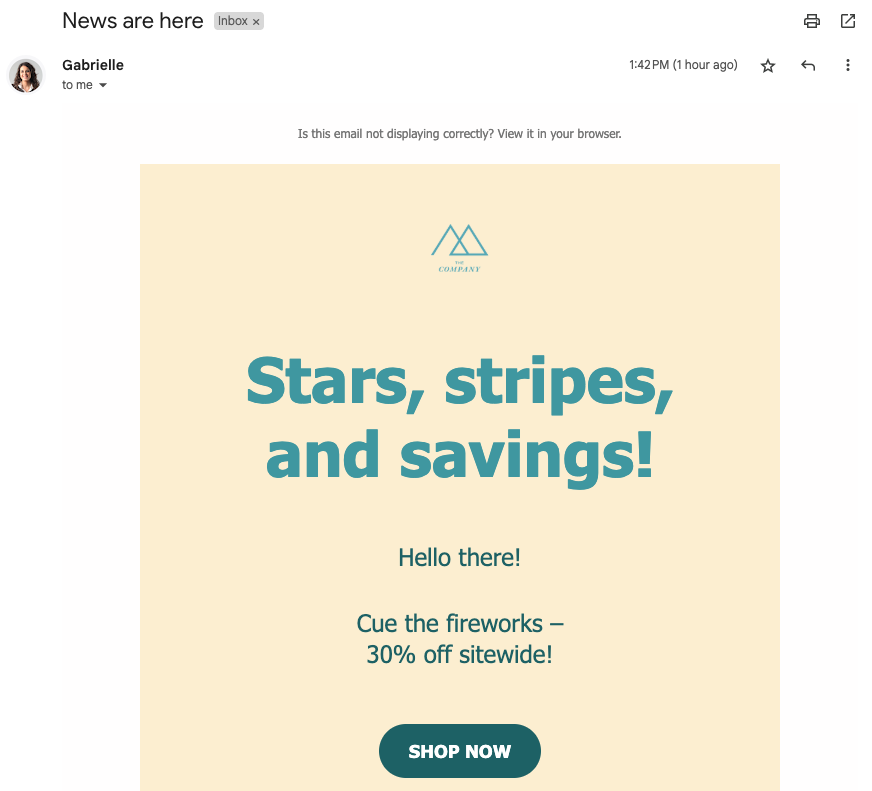
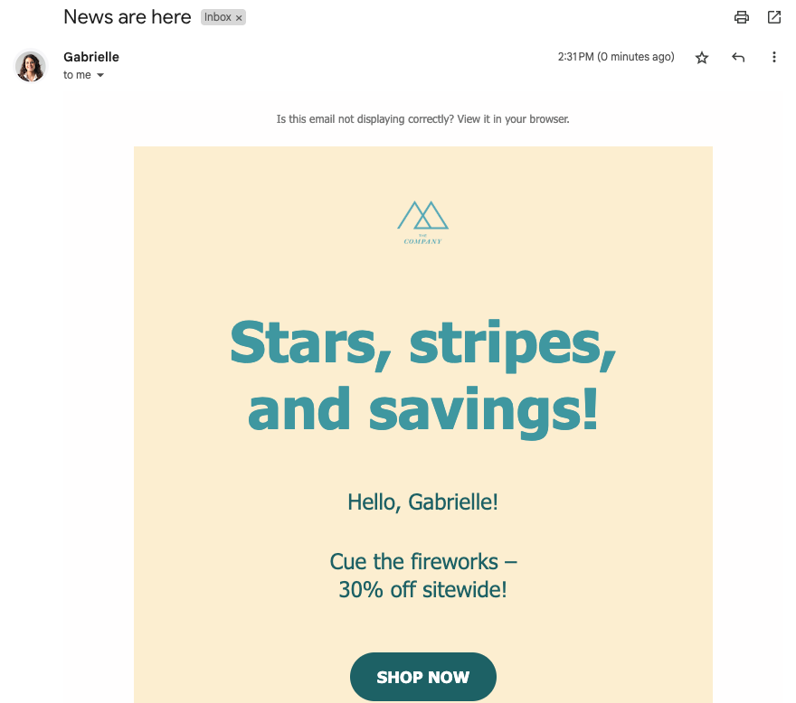
    When Gmail clips your email, subscribers see a message like this:

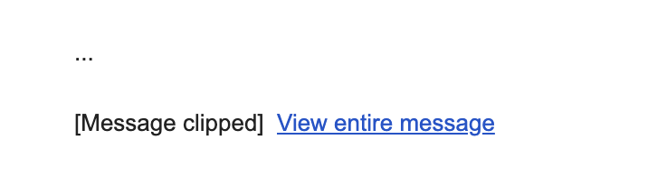
    If subscribers click “View entire message,” Gmail opens your email in their web browser, but this version may strip out some styling. Your carefully designed layout, colors, fonts, and formatting may appear broken or simply different from your original design.

    Understanding size limits

    Gmail’s size limits depend on the device:

    • Desktop: Generally around 102 KB
    • Mobile: Can range from 20 KB on iOS devices to approximately 75 KB on Android

    The 20 KB limit on Gmail’s iOS app is particularly strict and inconsistently applied, making it one of the most challenging environments for email delivery.

    Important: The size limit includes all HTML code, text content, CSS styling, and links, but does not include actual image file sizes. Images are hosted on Sender’s servers and loaded separately, so large images won’t directly cause clipping.

    Your email might also be clipped if you send multiple test emails with identical subject lines to the same inbox, as Gmail may consolidate these into a conversation thread.

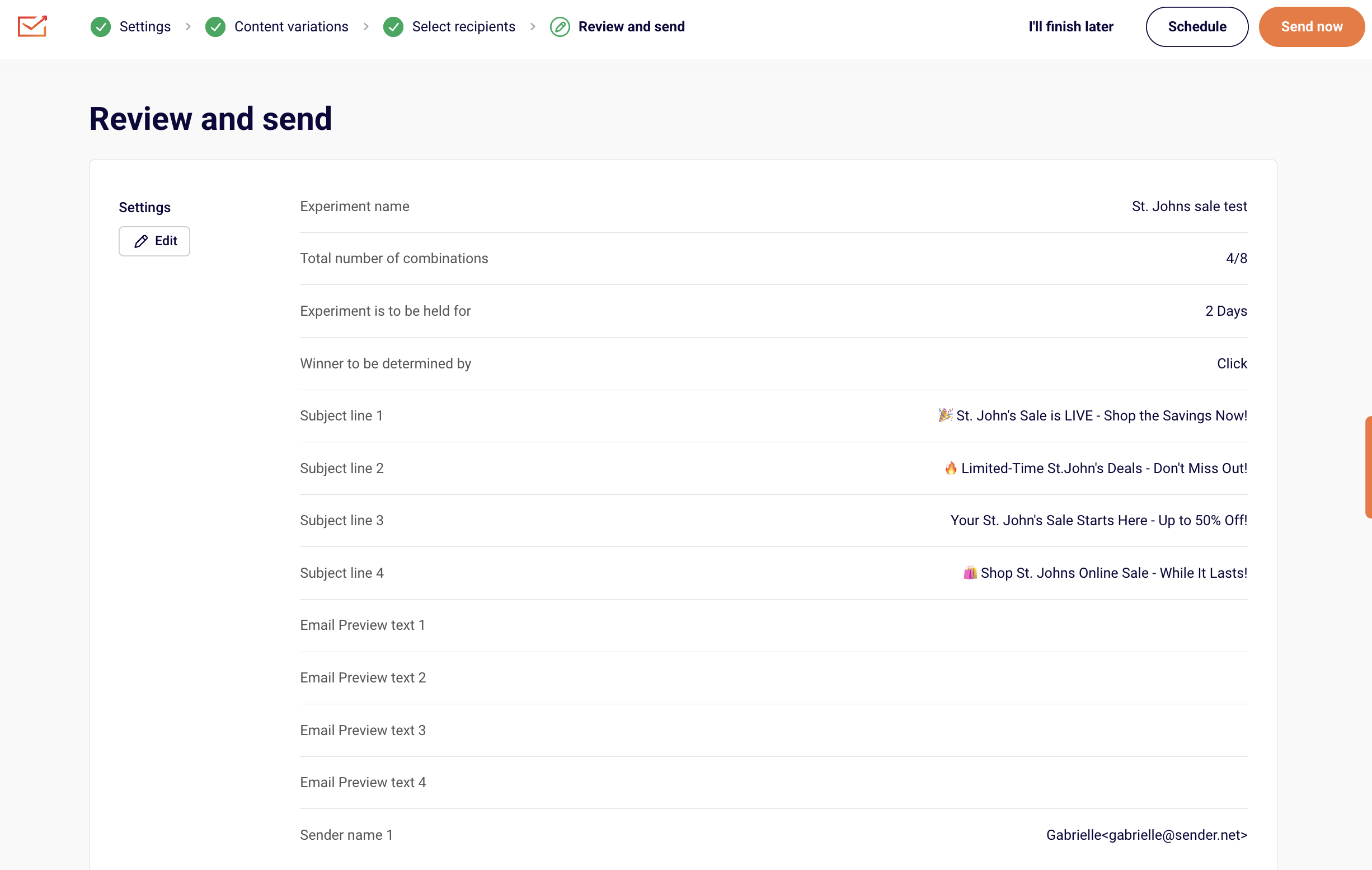
    Checking your email size in Sender

    Sender automatically monitors your email size and alerts you to potential clipping issues. 

    When your email exceeds the recommended size limits, you’ll see a Tips & Suggestions notification in the “Review and schedule” step of your campaign creation process. The warning will show:

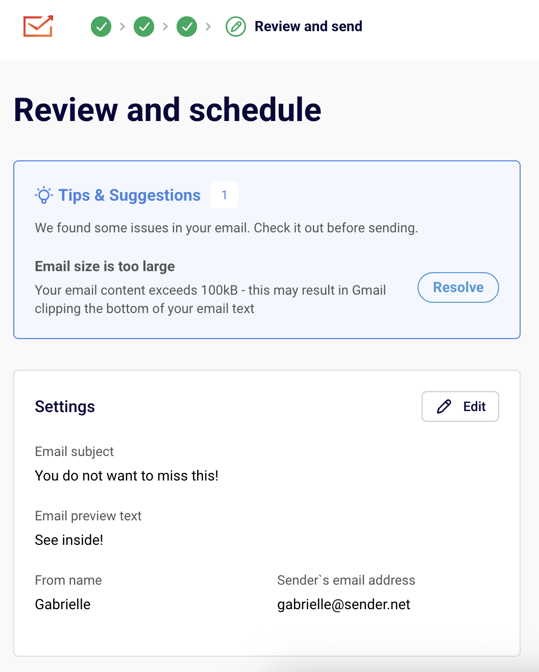
    Click the “Resolve” button to return to the email campaign editor and make changes if desired.

    If your email includes dynamic content or personalization, preview it with different subscriber profiles since the final size may vary.

    Size risk levels

    • Under 85 KB: Safe from Gmail clipping,
    • 85-95 KB: Might be at risk, especially on mobile devices,
    • Over 95 KB: Very likely to be clipped – optimization recommended.

    How to reduce email size

    You can optimize your emails without removing content by making these adjustments:

    Simplify your structure

    • Consolidate blocks: Combine multiple small text blocks with similar styling into fewer, larger blocks. Four separate text blocks contribute more to code weight than one larger block with the same content.
    • Merge sections: If you have multiple column sections in a row, combine them into a single layout rather than stacking separate sections.
    • Remove spacing sections: Look for opportunities to eliminate redundant spacing or padding sections.

    Clean up content

    • Use plain text pasting: When copying from Word documents or websites, paste as plain text (Ctrl+Shift+V or Cmd+Shift+V) to avoid importing unnecessary styling code.
    • Remove unused styles: Clean up any redundant CSS rules that accumulated during design.
    • Optimize colors and fonts: Using fewer unique colors and fonts reduces overall code weight.

    Optimize visual elements

    • Remove background images: Section background images add significant code weight. Consider replacing them with solid colors or simple patterns.
    • Minimize decorative elements: While images don’t count toward size limits, the HTML code needed to display them does. Focus on images that add value to your message.

    Find problem areas

    If you’re having trouble identifying what’s causing oversized emails:

    1. Duplicate your email template
    2. Remove sections or blocks one at a time
    3. Check the size after each removal to identify the heaviest elements
    4. Focus optimization efforts on components providing the biggest size reductions

    Best practices

    • Design mobile-first: Since mobile devices have stricter limits, designing for mobile ensures emails work everywhere
    • Test regularly: Check email size throughout the design process, not just at the end
    • Use Sender templates: Start with our optimized templates designed to stay within size limits
    • Monitor performance: Keep an eye on open rates and delivery metrics to catch clipping issues early

    Additional causes of clipping

    Your message might also be clipped if you send multiple emails to the same inbox with identical subject lines. To avoid this, use unique subject lines when sending test campaigns.

    That’s it!

    If you got stuck on a specific task or can’t find a way to execute a particular job, contact our support team via LiveChat or [email protected] – we’re here to help 24/7.

  • Use Google Fonts

    Typography can make or break your landing page conversions. The right font doesn’t just look good—it makes your message easier to read, builds trust with visitors, and can actually increase your conversion rates. Google Fonts offers professional-quality typography for free, making it the smart choice for high-converting landing pages.

    Why Google Fonts Are Essential for Landing Pages

    They’re completely free with no licensing restrictions, load fast from Google’s optimized servers, work across all browsers, and integrate easily with most website builders.

    Most importantly: good typography guides your visitors through your content smoothly and shapes their view of your brand. For landing pages, where the goal is to capture attention and drive action, nailing the typography is crucial.

    Best Google Fonts by Function

    Headlines (H1, H2)

    • Montserrat – Modern, clean, and attention-grabbing
    • Playfair Display – Elegant serif for luxury/premium brands
    • Inter – Clean sans-serif designed for digital interfaces
    • Roboto Slab – Contemporary serif for professional services

    Body Text

    • Open Sans – Most popular, highly readable for longer text
    • Lato – Warm and approachable while maintaining professionalism
    • Source Sans Pro – Crisp and clear on all devices

    Call-to-Action Buttons

    • Roboto – Strong and confident, makes CTAs pop
    • Montserrat – Bold weights perfect for standout buttons

    Proven Font Combinations

    Playfair Display + Lato. Headlines use elegant serif, body text uses friendly sans-serif. Perfect for sophisticated brands.

    Montserrat + Open Sans Modern geometric headlines with clean, readable body text. Great for tech/SaaS companies.

    Roboto Slab + Roboto Same font family provides natural harmony with clear hierarchy. Ideal for professional services.

    Golden Rules:

    • Limit to 2-3 fonts maximum – More creates confusion

    • Pair serif headlines with sans-serif body text – Classic combination that always works

    • Choose different but complementary fonts – Contrast without chaos

    Critical Font Sizes

    • Main headline (H1): 32-48px desktop, 24-32px mobile
    • Subheadings (H2, H3): 24-32px desktop, 20-24px mobile
    • Body text: 16-18px minimum (never smaller than 16px)
    • CTA buttons: 18-22px for maximum clickability

    Important: Use relative units (ems/rems) instead of pixels for better mobile scaling.

    Typography Best Practices That Convert

    1. Create Clear Hierarchy

    • Biggest: Main headline (your core offer)
    • Medium: Subheadings and key benefits
    • Smaller: Supporting details
    • Standout: Call-to-action buttons

    2. Mobile-First Approach

    50% of web traffic is mobile. Test fonts on actual devices, ensure readability without zooming, and use 1.4-1.6 line height for comfortable reading.

    3. Prioritize Readability

    • Ensure sufficient contrast between text and background
    • Avoid light gray text that’s hard to read
    • Remember: if visitors can’t read it, they can’t convert

    4. Optimize Loading Speed

    • Use only 2-3 font weights (regular, bold, maybe light)
    • Skip italic unless essential
    • More font variations = slower loading = lower conversions

    Conversion-Killing Font Mistakes

    • Using too many fonts – Looks unprofessional and confuses visitors
    • Choosing style over readability – Beautiful fonts that nobody can read don’t convert
    • Poor mobile experience – 79% of customers buy on smartphones
    • Loading too many font weights – Slows page speed and hurts conversions
    • Insufficient contrast – Makes people leave immediately

    The Bottom Line

    The best landing page fonts are the ones visitors don’t notice because they’re focused on your message and taking action. Typography shapes how people perceive your brand and directly impacts conversion rates.

    Start with proven combinations like Montserrat + Open Sans, prioritize readability over fancy styling, and always test on mobile devices. Remember: visitors should think about your offer, not struggle with your font choices.

    A well-designed landing page with proper typography can yield up to 27.4% higher conversions. That’s the difference between a successful campaign and a failed one.

    Ready to create landing pages with typography that converts? Try Sender’s landing page builder with built-in Google Fonts integration and start designing pages that drive real results.

    That’s it!

    If you got stuck on a specific task or can’t find a way to execute a particular job, contact our support team via LiveChat or [email protected] – we’re here to help 24/7.

  • Share landing page on social

    Want to get more eyes on your landing page? Social media is one of the best ways to drive traffic to your carefully crafted conversion pages. But here’s the thing—you can’t just slap a link up there and hope for the best.

    Let’s dive into how to do it properly so you actually get people clicking, visiting, and converting.

    Why Use Landing Pages Instead of Your Homepage

    Here’s the deal: customers who engage with us via our social media outlets generally spend approximately 2x more than the average customer. But only if you treat them right when they click through.

    When you send social media traffic to your homepage:

    • People get confused about what to do next

    • They explore other parts of your site and forget why they came

    • You miss out on conversions

    When you send them to a dedicated landing page:

    • They know exactly what you want them to do

    • The message matches what they saw on social media

    • An effective landing page can yield as much as a 27.4%increase in conversions

    Platform-Specific Tips

    Facebook & Instagram

    • Use eye-catching visuals (videos perform especially well)

    • Use your Instagram to highlight your latest offer through compelling imagery

    • Update your bio link strategically for new campaigns

    • Test both organic posts and paid ads

    X (Formally known as Twitter)

    • Match that Twitter mindset – quick, clever, and to the point
    • Use threads to tell a story that leads to your landing page
    • Include relevant hashtags for discoverability

    LinkedIn

    • Share valuable insights that lead naturally to your offer

    • Target specific professional audiences with LinkedIn ads

    • Share case studies and success stories

    TikTok

    • Create entertaining content that showcases your product

    • Use a descriptive headline “As seen on TikTok” on your landing page

    • Partner with creators who align with your brand

    Make Your Pages Look Great When Shared

    Open Graph (OG) image is a website thumbnail that displays when the page is shared on a social media platform and make sure to optimize these elements:

    • Title: Keep it under 60 characters and compelling

    • Description: Write 1-2 sentences that make people want to click

    • Image: Use high-quality visuals (1200×630 pixelsworks best)

    Pro tip: Make sure your social media post visuals match your landing page design for a seamless experience.

    Best Practices That Actually Work

    1. Match Your Message

    You should view your social media landing page as an extension of the social media post that led to it. If your Facebook ad promises “5 Ways to Double Your Email List,” your landing page better deliver exactly that.

    2. Keep It Simple

    Social media is busy and overwhelming. Your landing page should be the opposite. That is, Essential elements only:

    • Clear headline that matches your social media post

    • Brief explanation of your offer

    • Simple form or call-to-action button

    • One piece of social proof

    Declutter the page by getting rid of clashing colors, lengthy copy, website menus, social share buttons, and other things that might bombard your visitors.

    3. Mobile-First Design

    Around 50% of all web traffic globally comes from mobile devices, and most social media traffic comes from phones. Your landing page better look amazing on mobile.

    4. Remove Navigation

    Don’t you dare just send your social fans to the homepage. Remove navigation menus and keep people focused on your main call-to-action.

    5. Use Social Proof Smartly

    Since people are coming from social media, they’re in a “social” mindset. Use testimonials and reviews strategically.

    But remember: No social media tally is better than low social media tally. If you don’t have good numbers, don’t show them.

    Common Mistakes to Avoid

    • Sending everyone to your homepage – Too many distractions
    • Mismatched messaging – If your post says “free trial” but your page says “getting started,” you’ll confuse people
    • Ignoring mobile – 79% of customers now buy products online using their smartphones
    • Too many options – When faced with too many choices, website visitors may end up taking no action at all

    Measuring Success

    Track these key metrics:

    • Click-through rate from social media to your landing page

    • Conversion rate once people reach your page

    • Cost per conversion (for paid social ads)

    • Social shares of your content

    The Bottom Line

    Sharing landing pages on social media isn’t about posting a link and hoping for the best. It’s about creating a seamless experience from social media curiosity to taking action.

    Start with one platform where your audience is most active, create a landing page specifically for that audience, and test different approaches. Remember: every platform has its own personality, so adapt your approach accordingly.

    New-school marketing is about leveraging the multiplicative network effects of social media – where people market on your behalf. When you nail the combination of compelling social content and focused landing pages, you create a powerful conversion machine.

    Ready to create landing pages that convert social media traffic? Try Sender’s landing page builder and start turning your social media followers into customers today.

    That’s it!

    If you got stuck on a specific task or can’t find a way to execute a particular job, contact our support team via LiveChat or [email protected] – we’re here to help 24/7.

  • What is a landing page

    Simple answer: A landing page is a standalone web page designed to get people to do one specific thing. Whether that’s signing up for your newsletter, downloading a guide, or buying your product—it’s all about that single goal.

    Think of it like this: if your website is like a department store with lots of different sections to explore, a landing page is like a focused sales counter where you’re selling just one amazing thing.

    Why Landing Pages Matter (And Why Your Homepage Isn’t Enough)

    Here’s the thing most people get wrong: they send all their traffic to their homepage and wonder why nobody converts.

    Your homepage is great for showcasing your brand and letting people browse around. But when someone clicks on your ad promising a “Free Email Marketing Guide,” they don’t want to land on your homepage and hunt around for it. They want that guide, and they want it now.

    That’s where landing pages shine:

    • They match exactly what people expect after clicking your ad or link

    • They remove distractions and focus on one clear action

    • They turn more visitors into customers(seriously, way more)

    • They make your advertising dollars go further

    Having fewer links on your landing page increases conversions, as there are fewer tantalizing clickables that’ll carry visitors away from the call to action.

    The Magic Behind Landing Pages

    Landing pages work because of something researchers call the “paradox of choice.” The more options you give people, the harder it is for them to make a decision and act.

    Imagine you’re offering a free eBook, but your page also invites people to visit your blog, check out your products, and follow your social media. With each additional option, the chances of someone actually downloading your eBook get smaller because you’ve scattered their attention.

    A good landing page says: “Hey, you came here for this one thing. Here it is. Want it? Great, just click here.”

    Types of Landing Pages (And When to Use Each)

    • Lead Generation Pages. These are your workhorses for collecting contact information. You offer something valuable (like an eBook, webinar, or free trial) in exchange for someone’s email address and maybe a few other details.

    Perfect for: Building your email list, generating sales leads, promoting content downloads

    • Click-Through Pages. These pages warm people up before sending them to make a purchase. Think of them as your friendly salesperson who explains why your product is awesome before asking for the sale.

    Perfect for: E-commerce, software trials, expensive products that need some convincing

    • Sales Pages. Straight to the point: these pages are designed to get people to buy right now. They include all the details, benefits, and social proof needed to close the deal.

    Perfect for: Direct sales, limited-time offers, lower-priced products

    • Event Registration Pages Whether it’s a webinar, conference, or local meetup, these pages get people signed up and excited about attending.

    Perfect for: Webinars, workshops, product launches, networking events

    What Makes a Landing Page Actually Work

    A Headline That Grabs Attention Your headline should immediately tell people they’re in the right place. If your ad promised “10 Email Marketing Tips,” your headline better mention those exact tips.

    One Clear Call-to-Action “Download Now,” “Start Free Trial,” “Get My Guide”—whatever it is, make it crystal clear what happens when someone clicks that button.

    Just Enough Information Give people what they need to make a decision, but don’t overwhelm them. Think “helpful summary,” not “complete novel.”

    Social Proof That Builds Trust Testimonials, customer logos, download numbers—anything that shows other people love what you’re offering.

    Mobile-Friendly Design More than half your visitors are probably on their phones. If your page looks terrible on mobile, you’re losing money.

    Landing Pages vs. Your Homepage: The Showdown

    Here’s a quick comparison to make it crystal clear:

    Homepage:

    • Shows off your entire business

    • Has tons of navigation links

    • Appeals to lots of different visitors

    • Encourages exploration and browsing

    Landing Page:

    • Focuses on one specific offer

    • Minimal or no navigation links

    • Targets people with a specific interest

    • Pushes toward one clear action

    On a typical homepage, you can find at least 10 links. On a well-optimized landing page, though, you’ll usually find fewer links, and sometimes only one.

    When Should You Create a Landing Page?

    Running Paid Ads? Always send that traffic to a dedicated landing page, not your homepage.

    Launching Something New? Create a landing page to build excitement and collect early signups.

    Promoting a Specific Offer? Whether it’s a discount, free trial, or content download, give it its own page.

    Testing a New Audience? Landing pages let you speak directly to different customer segments with tailored messaging.

    Want Better Email Signups? A focused landing page will always outperform a generic “subscribe to our newsletter” form.

    The Bottom Line

    Landing pages aren’t just “nice to have”—they’re essential if you want your marketing to actually work. Landing pages across different industries typically convert at a rate of 10.76%, but top pages can achieve a conversion of 27% and higher.

    Every marketing campaign deserves its own landing page. Every special offer needs a focused page. Every time you’re asking people to take a specific action, you need a page designed for exactly that purpose.

    The best part? You don’t need to be a designer or developer to create them. Modern landing page builders make it easy to create professional pages that convert—no coding required.

    Want to create landing pages that actually convert? Try Sender’s landing page builder and start turning more visitors into customers today.


    If you got stuck on a specific task or can’t find a way to execute a particular job, contact our support team via LiveChat or [email protected] – we’re here to help 24/7.

  • Landing page SEO basics

    Absolutely! Landing pages can be incredibly SEO-friendly, and here’s the thing most marketers miss: they’re actually some of the best pages to optimize for search engines. Why? Because they’re laser-focused on getting people to take action, which is exactly what search engines want to deliver to their users.

    Why Should You Care about Landing Page SEO?

    Think about it this way: you’re already putting effort into creating amazing landing pages that convert. So why not make them work double-duty by getting them found organically too?

    Here’s what happens when you nail landing page SEO:

    • You stop paying for every single click and start getting free traffic

    • You attract visitors who are actually ready to buy or sign up (not just browsing)

    • Your cost per acquisition dropssignificantly

    • You get both visibility AND conversions from the same page

    How to Make Your Landing Pages SEO Gold

    1. Pick Keyword That Actually Convert

    This isn’t about ranking for “marketing tips” when you’re selling software. You want people who are ready to whip out their credit card. Look for keywords like:

    • “Buy project management software”

    • “Email marketing tool free trial”

    • “Download lead magnet template”

    • “Sign up for CRM demo”

    These phrases tell you someone’s past the “just looking” phase and ready to take action.

    2. Get Your Technical Stuff Right

    • Your Tittle Tag is Your First Impression.  Put your main keyword up front and make it irresistible. Instead of “Marketing Software | Company Name,” try “Get More Leads with Our Marketing Automation Tool.”

    • Meta Descriptions Matter. You’ve got about 160 characters to convince someone to click. Use them wisely! Tell people exactly what they’ll get and why they should care.

    • Clean Up Your URLs. Nobody wants to see messy URLs filled with random numbers and tracking codes. Keep it simple and descriptive – use clean, readable URLs that actually tell people what the page is about.

    3. Write Like a Human (Because You Are One) 

    Here’s where a lot of people mess up: they stuff keywords everywhere and forget they’re talking to real people. Don’t do that. Instead:

    • Write headlines that grab attention AND include your keyword
    • Answer the question your visitor actually has
    • Guide them smoothly toward your call-to-action
    • Use your keyword naturally throughout (if it feels forced, it probably is)

    Pro tip: Read your content out loud. If it sounds weird, rewrite it.

    4. Make It Work on Every Device

    More than half your visitors are probably on their phones. If your landing page looks broken on mobile or takes forever to load, they’re gone. And so are your rankings. Quick mobile checklist:

    • Does everything load in under 3 seconds?

    • Can you easily tap buttons without zooming in?

    • Is the text readable without squinting?

    • Does the page look good in both portrait and landscape?

    5. Speed Really, Really Matters

    Google cares about page speed, but more importantly, your visitors do. If your page takes more than a few seconds to load, people will bounce faster than you can say “conversion rate.” Easy wins for faster pages:

    • Compress your images (seriously, that hero image doesn’t need to be 5MB)

    • Choose a hosting provider that doesn’t cut corners

    • Remove anything that doesn’t help with conversions

    6. Don’t Forget the Details

    Images need love too:

    • Name your files something descriptive (not “IMG_1234.jpg”)

    • Add alt text that describes what’s in the image

    • Keep file sizes reasonable

    Your call-to-action button: Make it impossible to miss and crystal clear what happens when someone clicks it. “Submit” is boring. “Start My Free Trial” tells a story.

    What Not to Do (Learn from Others’ Mistakes)

    • Trying to rank for everything – Pick one main keyword per page and stick with it
    • Forgetting mobile exists – Test your pages on actual phones, not just browser dev tools
    • Making people wait – If it takes more than 3 seconds to load, you’re losing money
    • Writing for robots – Google’s smart enough to understand natural language now
    • Weak calls-to-action – “Click here” tells people nothing. “Get my personalized quote” tells them everything.

    How to Know If It’s Working

    Keep an eye on these numbers:

    • Where you rank for your target keywords (obviously)
    • How much organic traffic you’re getting
    • Whether people stick around or bounce immediately
    • Most importantly: how many of those organic visitors actually convert

    The magic happens when all these numbers move in the right direction together.

    The Bottom Line

    SEO-friendly landing pages aren’t just possible—they’re one of the smartest moves you can make. You’re creating pages that both search engines and humans love, which means more traffic AND more conversions.

    The best part? You don’t have to choose between ranking well and converting well. With the right approach, you get both.

    Start with one landing page, apply these principles, and see what happens. Once you see the results, you’ll want to optimize every landing page you’ve got.

    Ready to create landing pages that actually get found? Try Sender’s landing page builder and start turning your SEO traffic into customers today.

    That’s it!

    If you got stuck on a specific task or can’t find a way to execute a particular job, contact our support team via LiveChat or [email protected] – we’re here to help 24/7.

  • A/B test email campaigns

    Our new Experiments feature is here to help you get the most out of every email campaign you send! With Experiments, you can easily test different versions of your emails—whether it’s the subject line, the sender name, the send time, or even the content itself.

    Think of it like this: instead of guessing what might work best, you’ll actually know what works, because your audience will show you with their opens and clicks.

    Why Use Experiments?

    Here are just a few reasons why using Experiments can seriously improve your email marketing results:

    • Find what your audience loves: Understand what types of subject lines, content, or sender details drive better engagement.
    • Avoid low-performance sends: Instead of sending one version to everyone, you test a few and only send the winning version to most of your audience.
    • Make data-backed decisions: Stop guessing. Start sending smarter.
    • Improve future campaigns: Use your learnings to keep growing and optimizing.

    Setting up an Experiment

    Setting up your first experiment is simple and intuitive. Just follow these steps:

    Head over to Experiments and click Create your first experiment. 

    You’ll begin by naming your experiment—choose something descriptive so you can quickly identify what you’re testing (e.g. Subject Line Test – Summer Promo or Content Test – New Template).

    You will also have to choose the Winning metric and the Duration of the experiment.

    You can test up to 8 combinations. You can mix them up if you see fit:

    • Subject lines
    • Sender names
    • Send times
    • Content variations

    However, we strongly recommend testing only one variable at a time to clearly identify what’s making the impact—whether it’s opens or clicks.

    • Winning Metric: Select what metric will determine the winning variation—opens or clicks. (See below for tips on which to use.)
    • Duration: Set how long you want the experiment to run. You can choose from hours, days, weeks, or even months—but we recommend keeping it under 24 hours for most experiments.

    Here is an example of testing subject lines. Choose the Subject Line option, then enter all the variations you want to test.

    After that, select one sender name and email address that will stay consistent across all variations (since we’re only testing subject lines here). When you’re done, click Save and continue.

    Next, set up the content for your campaign. Choose between:

    • Drag & Drop Builder,
    • Plain Text Email,
    • Custom HTML.

    Pick a template or start from scratch, then customize it as needed and save the changes.

    In the next step, choose the groups and/or segments you want to include in your experiment. You can also exclude specific groups or segments to narrow down your audience, or simply select all active subscribers if you’d like to reach your full list. 

    This step ensures you’re targeting the right audience for meaningful results.

    Make sure to select at least 1000 recipients to have a winner selected.

    Once you select your recipients (if the selected amount is 1000 or more) you will be asked to edit the experiment settings and select the test and winning group sizes.

    • Test Group Size: Define what percentage of your total audience will receive the test. For example, if you’re sending to 1,000 subscribers, you might choose 30% (300 people) for testing.

    • Winning Group Size: The remaining percentage (e.g., 70%) will receive the winning variation once a winner is selected.

    Once the test group receives all the selected combinations and the duration ends, Sender will automatically determine the winner based on your chosen metric and send it to the remaining (Winning) audience.

    In the final step, you’ll see an overview of your experiment setup: all the subject lines, sender names, content variations, and testing settings. 

    If everything looks good, you can either send your experiment immediately or schedule it for a later time that best suits your audience.

    Best Practices for Experiments

    Which metric to choose?

    Use Opens as your winning metric when testing:

    • Subject lines

    • Preview text

    • Sender names

    • Reply-to email addresses

    • Sending time

    Use Clicks as your winning metric when testing:

    • Email content (e.g. layout, images, CTAs, offers)

    • Send time (if you want to see who actually engaged beyond just opening)

    How long should your experiment run?

    Duration depends on the size of your audience:

    • Up to 5,000 subscribers → Run for up to 24 hours

    • 5,000–20,000 subscribers → Run for around 12 hours

    • 20,000+ subscribers → Run for 4–8 hours (your list is big enough to get fast data)

    IMPORTANT: Avoid low-activity periods, like weekends or late nights, when subscribers are less likely to engage. Testing during these times could give you misleading results.

    How many variations should I test?

    • Up to 5,000 subs → Stick to 2 variations

    • 5,000–20,000 subs → You can try 3 variations

    • 20,000+ subs → You can go bigger and test more complex setups

    The goal is to test efficiently—not overwhelm your audience or stretch the test too thin.

    Start small, keep it simple, and use your learnings to send smarter campaigns every time.

    That’s it!

    If you got stuck on a specific task or can’t find a way to execute a particular job, contact our support team via LiveChat or [email protected] – we’re here to help 24/7.

  • Use liquid tags

    Liquid tags help you personalize your emails by inserting dynamic content like the subscriber’s name, location, product history, or cart items—automatically. They’re a powerful way to create meaningful, relevant, and engaging messages for every individual on your list, without manually customizing each email.

    Whether you’re welcoming a new subscriber or nudging someone to complete their purchase, liquid tags make your emails feel personal, timely, and smart.

    What are Liquid Tags?

    Liquid tag is a templating language that uses placeholders and logic to insert dynamic content into your emails.

    {{ … }} → Outputs data (e.g. a name, a product, a price)

    {% … %} → Controls logic (e.g. if/else conditions, loops)

    | → Applies filters to format or modify data (e.g. upcase, default)

    Example:

    Hello {{ firstname | default: "there" }}

    Inserts a subscriber’s first name, or “there” if the name is missing.

    Result:

    If the subscriber’s name exists in the subscriber list → Hello Gabrielle!

    If the subscriber’s name does not exist in the subscriber list → Hello there!

    Why Use Liquid Tags?

    • Personalize at scale (no manual editing)

    • Improve open rates and conversions

    • Make subscribers feel seen and understood

    • Adapt content to location, behavior, or preferences

    • Keep your campaigns efficient and relevant

    Top use cases & examples

    1. Personalized subject lines with fallbacks

    Use a subscriber’s first name—or provide a friendly default if it’s missing.

    Example:

    Subject: 

    {{ firstname | default: "Hey" }}, your exclusive offer is inside!

    Why it works:

    • Adds a personal touch to the inbox

    • Increases open rates

    • Makes your message feel written just for them

    2. Show relevant products based on interest or segment

    If you don’t have real-time product tracking, no problem—you can still create relevant product suggestions by using custom fields or behavioral tags like favorite categories or past clicks.

    Example: Let’s say you collect a custom field like favorite_category during signup or through a quiz.

    Subject: 

    Explore more in {{ favorite_category | default: "our bestsellers" }}

    Email body:

    Hi {{ firstname | default: "there" }}

    We thought you might like these picks from our {{ favorite_category | default: "latest collection" }}:

    Why it works:

    • Feels personalized even without product tracking

    • Easy to implement with custom fields or tag-based segmentation

    • Allows you to highlight relevant products for each group

    3. Insert cart details into recovery emails

    Display the items they left behind—complete with name and price.

    Example:

    Hi {{ firstname | default: "there" }}

    You left this in your cart: 

    {% for item in cart_items %} 

    {{ item.name }} for {{ item.price }}
    {% endfor %} 

    Finish your purchase before it’s gone!

    Why it works:

    • Creates urgency with real product details

    • No manual entry needed

    • Increases cart recovery with context

    4. Recommend products based on behavior

    Show personalized product suggestions based on what the subscriber liked or purchased.

    Example:

    Based on what you liked, you might also love: 

    {% for product in recommended_products limit: 3 %} 

    {{ product.name }} – only {{ product.price }}
    {% endfor %}

    Why it works:

    • Feels like a curated recommendation

    • Encourages discovery and upsells

    • Works well in post-purchase or re-engagement campaigns

    5. Location-based content

    Change messaging based on the subscriber’s country or region.

    Example:

    {% if country == "USA" %}
    Free shipping across the US! 

    {% elsif country == "Germany" %}
    Versandkostenfrei in Deutschland!
    {% else % }
    Check your local rates at checkout.
    {% endif %}

    Why it works:

    • Helps global brands adapt content by market

    • Builds trust with regionally specific details

    • Improves clarity around shipping, pricing, or offers

    Most commonly used tags

    Here’s a quick list of the most popular Liquid tags and what they do — copy & paste as needed!

    {{ firstname }} → inserts first name

    {{ firstname | default: "there" }} → fallback if name is missing

    {{ country }} → inserts the subscriber’s country

    {% if country == "US" %} ... {% endif %} → shows a section only to US subscribers

    {% if customfield == "yes" %} ... {% endif %} → shows a section if a field is set

    {% for item in cart_items %} ... {% endfor %} → loops through cart products

    {{ product.name | upcase }} → transforms product name to uppercase

    {{ product.price | round }} → rounds the price number


    If you got stuck on a specific task or can’t find a way to execute a particular job, contact our support team via LiveChat or [email protected] – we’re here to help 24/7.